Ashlea Hickin
Media Studies
A shy student trying to reach his family in Ohio, a gun-toting tough guy trying to find the last Twinkie, and a pair of sisters trying to get to an amusement park join forces to travel across a zombie-filled America. - IMDB

The costume of the person consists of items that you would expect people to wear on a regular basis, for example jeans and a t-shirt. This makes his character more relatable to the audience and means that they are more sympathetic towards him because of this. It also makes his character more similar to the lives of people watching which may make them feel more vulnerable as it suggests that what's happening to him could happen to anyone. The colour green would have been chosen for his shirt because it represents natural life and safety; however this is greatly contradicted because it is clear that he is in great danger. Blue would have been chosen for his jeans because it is the most stereotypical colour of jeans, therefore emphasising that he is just a stereotypical person. I discovered that the costumes of the victims are usually made up of everyday items of clothing. This was especially the case in World War Z which introduced us to many normal people during the opening.
The costume of the zombie also consists of very normal, everyday items of clothing such as tracksuit bottoms and a hoodie. These items would have been chosen to show that he is slightly different from the person. His costume also relates to the setting which explains why he is there but confuses us slightly as to why the other man is there, particularly because of his size. The familiarity that the audience have with the items he is wearing makes him seem more human and may also make the audience feel uncomfortable as it appears that anyone can turn into a zombie. The colour black would have been chosen because it represents death and danger, therefore suggesting that his character is very dangerous. Blue would have been used to represent life and that the zombie is still a threat despite the fact they are dead. The zombies in Warm Bodies were also presented in a similar way as they too were wearing everyday items of clothing to make them seem similar to those who are not yet zombies. It also makes them more threatening because of their similarity.
The setting is an American football pitch which would have been used because it is a familiar setting as most people have visited some sort of sports field at some point in their lives. This makes it more realistic for the audience and also more frightening because of this. Regular, realistic settings were used in lots of the other films I have looked at, such as warm bodies which uses an airport.
The lighting used in this shot is high key lighting which comes from the floodlights around the edge of the pitch. This allows the audience to clearly see what is going on. The fact that it is night time is very stereotypical of apocalyptic films, therefore making it more eerie and creepy for the audience. The lighting that is there does not light up the whole of the setting, therefore forcing the audience to focus on the events taking place. Some of the other films I have analysed for example, 28 Days Later used low key lighting throughout the opening so that the audience were less aware of what was going on. This was equally as effective as the high key lighting used in this film because the fear of the unknown made you feel anxious for the characters.
There are a variety of colours used in this shot. The colour grey which is used on the seating in the background represents death and loss, therefore suggesting that the zombie is probably going to kill the man. The fact that they are surrounded by grey seating also suggests that there is no way of escaping. The colour green would have been used for the pitch because this makes it more stereotypical for the audience. The small hints of red on the pitch represent danger and therefore suggest to the audience that something bad is going to happen. I found that it was a common theme for there to be a lack of colour as films such as The Purge tended to wash out lots of colour to make it look darker and more unsettling.
The shot used is a tracking shot which allows the audience to follow the action. It also makes the audience feel more involved as it makes them feel like they are actually there watching it happen. This could make the audience feel excited to see what happens as it looks quite amusing but could also make them feel more vulnerable as it may make them feel that the same thing could happen to them. The background is also slightly out of focus which forces all of the audience's attention onto the chase. I have noticed that tracking shots are a conventional shot for this genre of film, so we will keep this in mind when planning our own opening.

To the left is an example of a point of view shot, another conventional shot for the apocalyptic genre. This allows the audience to have the same experience of the situation as the character in the film, therefore making them feel more involved and engrossed in the film. In this particular shot, the zombie appears to be making eye contact with the camera and looking at the audience. This could make them feel at risk as the shot also shows the zombie from a low angle, therefore suggesting that the zombie is more powerful than normal people. I think it is highly effective as it makes you feel personally in danger which is the sort of feeling that people watching this film will want to get.

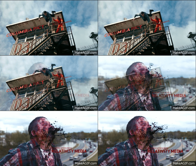
Throughout the whole duration of the opening credits, slow motion is used. This allows all of the actions taking place to be emphasised and allows the audience longer to watch and take in what is happening. In this case, it is used to emphasise the danger of the zombies and the effect that they are having on the regular people. The part where the zombie spits up blood would have been deliberately put in slow motion to gross the audience out and highlight the problem. I have not noticed the use of slow motion in many of the openings I have an analysed however, I have noticed that it is most commonly used during an action sequence as it allows the audience to watch the action but distances them from it slightly to make them feel safer. They also get to see and realise the elements of danger before they happen.
At the beginning of the opening, there is a voiceover of someone who is explaining what has happened to America. I have noticed that voiceovers are used quite often in horror and apocalyptic films as it allows you to know what someone else is thinking about the same situation. It also makes the film more personal to each audience member as it sounds as if they are talking to you personally. The person doing this voiceover sounds as if they are about 18 years old, the same age as many of the people who are watching the film. This decision would have been made because it gives the audience an accurate opinion that they can relate to as the person is so similar to their age, also, the fact that they speak in the same way that you would expect an 18 year old to speak makes it more realistic and believable. The additional information also makes it easier for the audience to understand what is going on. The same idea was also used in Warm Bodies in which the voice over allowed us to learn more about the main character and what he was thinking. This is effective as the audience get to know the character in a more personal level and can therefore connect more with his character.

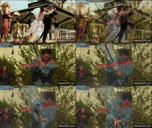
The credits are in a sans serif, capitalised font which makes it appear more informal and more suited to the teenage audience. The colour red would have been chosen because it has connotations of danger and blood so therefore fits with the overall genre of the film. It also means that it stands out very clearly in the shot and as a result has more of an impact on the audience. All of the credits are in the same font style however the names of the people tend to be bigger than their occupation. This means that the audience pay more attention to the names which could make them more excited to watch the film if they recognise any of the names or are a fan of any of them. By keeping all of the fonts the same, it tells the audience that they are all connected. Probably the most interesting part about these opening credits is the fact that they have been embedded into the action, meaning that in the example on the right, when the man smashes the glass, the title of the film smashes with it. This helps to make the film more realistic and also makes the credits more exciting for the audience. It also focuses them more on the action and the slow motion allows them time to read and remember what it says before they are destroyed by the following events. I haven't seen this as being a common feature in this genre however, I think it is highly effective and a very unique way of getting the audience hooked.